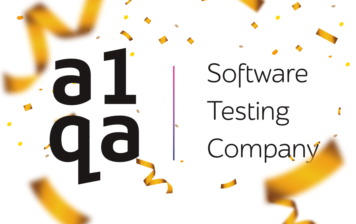
Meet a1qa new logo and website design!
If you’re reading this piece of news, you’re on a1qa and you see that things look a bit different around here.
What was the inspiration behind these changes?
The reason for the big change we initiated was to bring our look in line with the way we perceive ourselves.
Over the years, a1qa has been developing and transforming from a small QA department into an independent software testing provider. We’ve become a mature company, internationally recognized and well-known in the field.
For 15 years, we’ve also accumulated different styles. At some point, we felt like our design and colors were a bit tired and didn’t characterize our engaging nature and the company’s maturity and stability.
Furthermore, the opportunity to jump-start the new year 2019 with a clean slate and fresh look was too big to miss it. So, without further ado, we’re excited to share with you…
…a new look of a1qa.

The new visual design was created with the following concepts taken as a basis:
At a1qa, we always strive to promote one-of-a-kind solutions to meet the clients’ needs instead of following usual and trivial ways of problem-solving. A gradient bright stripe in the logo is a symbol of the company’s passionate, talented and enthusiastic employees that help to develop unique QA solutions for every project.
With the new design, both logo and a website now have a cleaner, less colorful and restrained look which is meant to put more emphasis on words and our website content.
Dmitry Tishchenko, CMO at a1qa shares his opinion on this considerable step in the company’s development:
‘We wanted our new look and logo to be approachable and distinctive. Now it feels more modern and readable, and we hope that you enjoy it as much as we do.
I hope that such a big change will mark a good beginning of the year full of productive work, new acquaintances, and big achievements for a1qa!’